Trying Out Figma
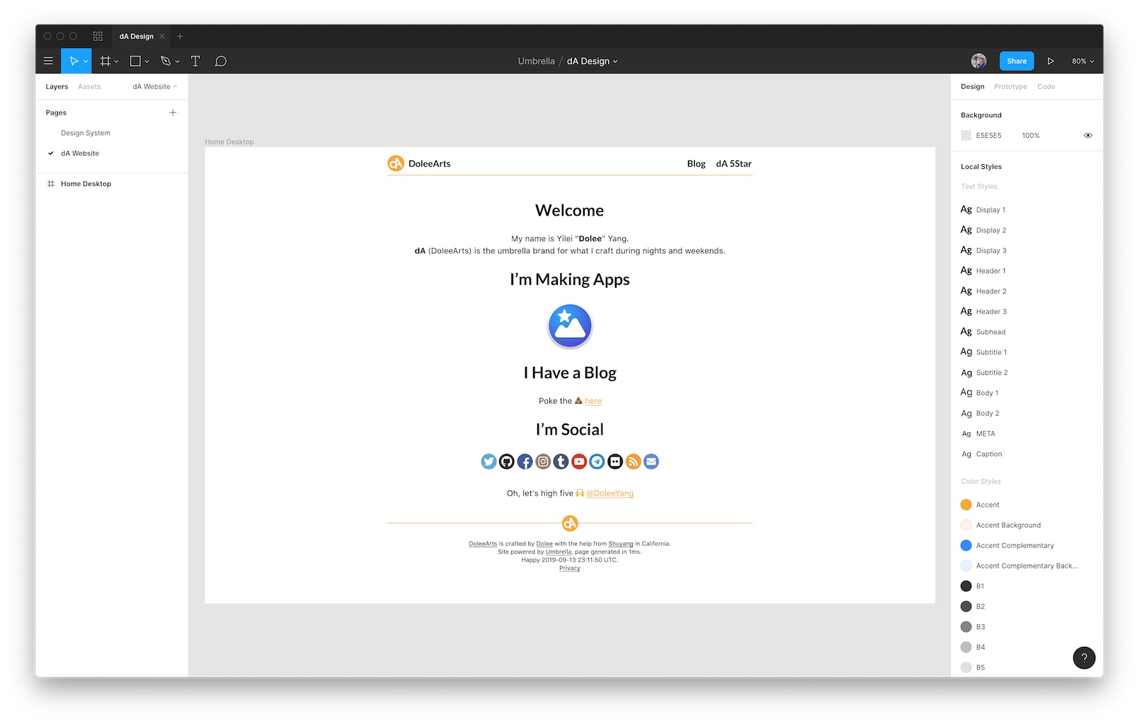
This week I finally sit down and got my hands dirty in design. I partially explored design systems, sketched some logos, colors, and typography in Figma. Then I tried a slight re-design of my website's home page:

A version of the https://mangoumbrella.com design in Figma.
Figma is really intuitive. When I first saw others' cursors moving in real time, it blew my mind. But for me as a one-person shop, its intuitive interface is the reason I love it. I tried Photoshop, Illustrator, and Sketch. They all failed me. Figma is the first tool I felt home-ish. I still struggle with it, but I do see its potential in my workflow.
I know the design I did today isn't great. It's not even good. It's the worst thing I will probably come up with. And I'm not updating my home page to be exactly what I have designed.
However, the design did improve the website in some areas. And I just incorporated them in the latest build.
Separating code and design does make the product better. I will spend more time on dedicated design sessions.